Cents
Reimagining How Laundromats Set Up Pickup and Delivery at Cents
Overview
Cents is a business management platform helping laundromat operators grow and manage their businesses.
In June 2025, I joined the Cents design team as a summer intern to contribute to and organize their maturing design system and bring outdated screens up to date.
Objective
Over 40% of Cents laundromat locations have pickup and delivery enabled, and the pickup and delivery setup flow and delivery settings panels are some of the product’s oldest screens.
The existing flow was abrupt and confusing, particularly for operators with limited technology experience or who speak English as a second language.
My objective was to redesign how laundromat operators set up and managed their pickup and delivery service to improve user independence and satisfaction through a more intuitive and informed setup experience.
Through my redesign, I also aimed to reduce the workload of Cents’ Customer Success team, who frequently spent up to two hours on a call walking operators through the pickup and delivery setup process.
Process
The redesign process included the following steps over the 5 weeks:
1
Research
- Heuristic evaluation
- Stakeholder interviews
- User observations & interviews
2
Ideation + Design
- User stories
- Product flow
- High fidelity wireframes
- Interactive prototypes
3
Feedback
- Design critique
- Stakeholder presentation
- Customer walkthrough
4
Iterations + Handoff
- Iterations
- Edge cases & annotations
- Component documentation
- Handoff walkthrough meeting
Research
I came to understand the current flow through four qualitative research methods:
Heuristic Evaluation
I started by mapping out the existing flow, noting instances of poor affordances, low discoverability, and outdated design components.
Stakeholder Interviews
To identify areas of improvement, I asked Cents’ customer success team for where they most frequently assisted customers in the flow.
In-App Sessions
Using Fullstory, I conducted a funnel analysis to identify users that dropped off from the pickup and delivery setup flow, and I watched sessions for usability issues, rage clicks and friction points.
User Interviews
I interviewed two operators who had both used the product for over a year. We walked through the flow, and I followed up on questions that I had after watching user sessions.
Research Findings
01
Both operators and Cents team members were frustrated by the current time windows, which were difficult to compare and could not be removed by operators.
02
The biggest drop-off point for operators was the first step when configuring the geographic zones that their location will serve.
03
Operators often needed more information and/or context for select settings and reached out to their CS member for help.
Design Process
1 - REMOVING PRIMARY PAIN POINT
Designing for Archiving Windows
Pickup and delivery windows are the specific times each week when the end customer can schedule their laundry to be picked up or delivered.
Existing Design: Tabs Siloed Each Window
Problem: Operators frequently manage 8-15 windows per location, and the existing design made it nearly impossible to audit, compare, or remove outdated windows, which led to misconfigured schedules, missed pickups, and support tickets.
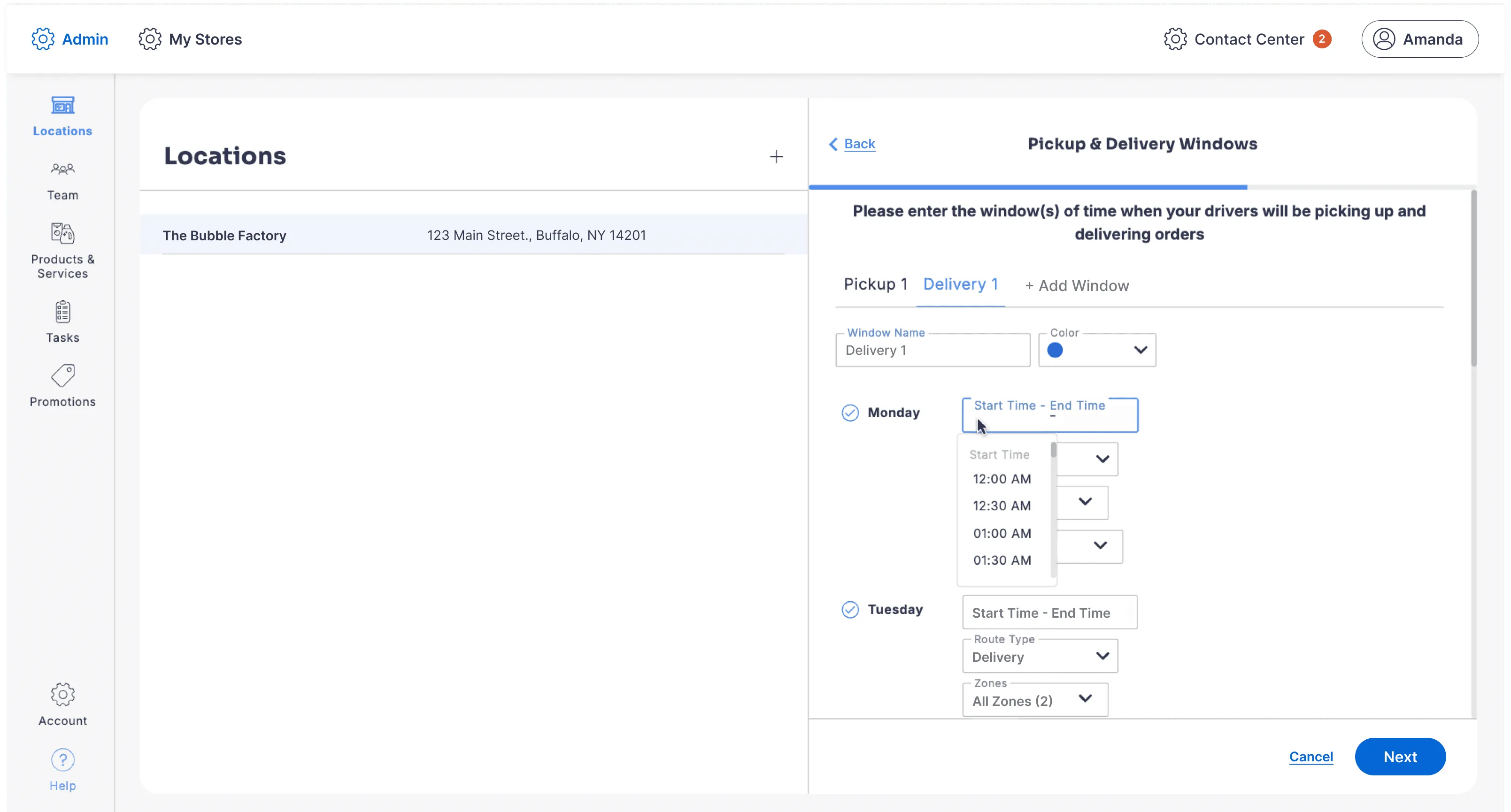
- Tabbed view makes it difficult to quickly compare windows.
- Vertical layout elongates panels with lots of space
- Operators cannot archive windows once created.
Top Feature Request: Removing Windows
During my research, 100% of the operators and Cents CS team members I spoke with mentioned needing a way to delete or archive windows.
If an operator wanted to remove a window, they would need to contact their CS team member who would file a ticket on their behalf with the dev team, who would eventually archive it.
Plus, one operator had a location with over 15 different windows, and to compare two windows, she had to click through each tab, scroll through the panel, and then write down the details with a pencil and paper.
My Solution:
New Scannable Window Card Component
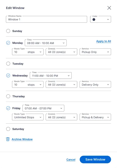
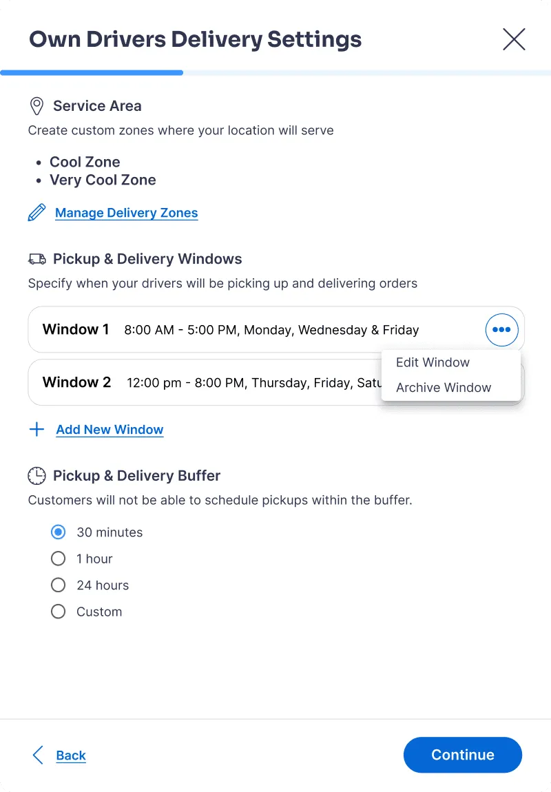
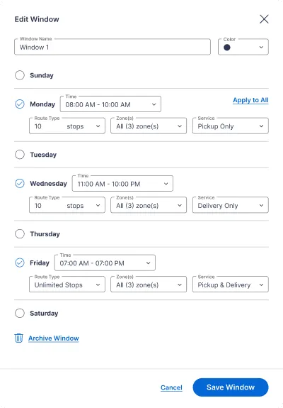
I introduced a card component for each window to make it easy to compare windows at a glance.
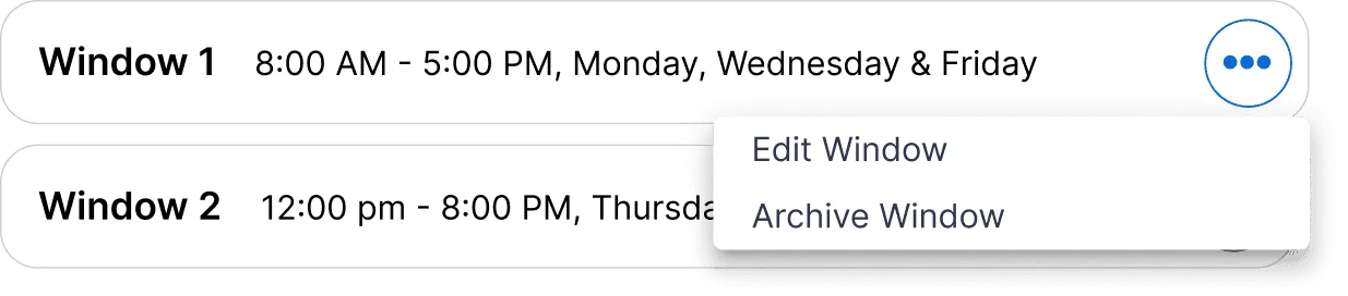
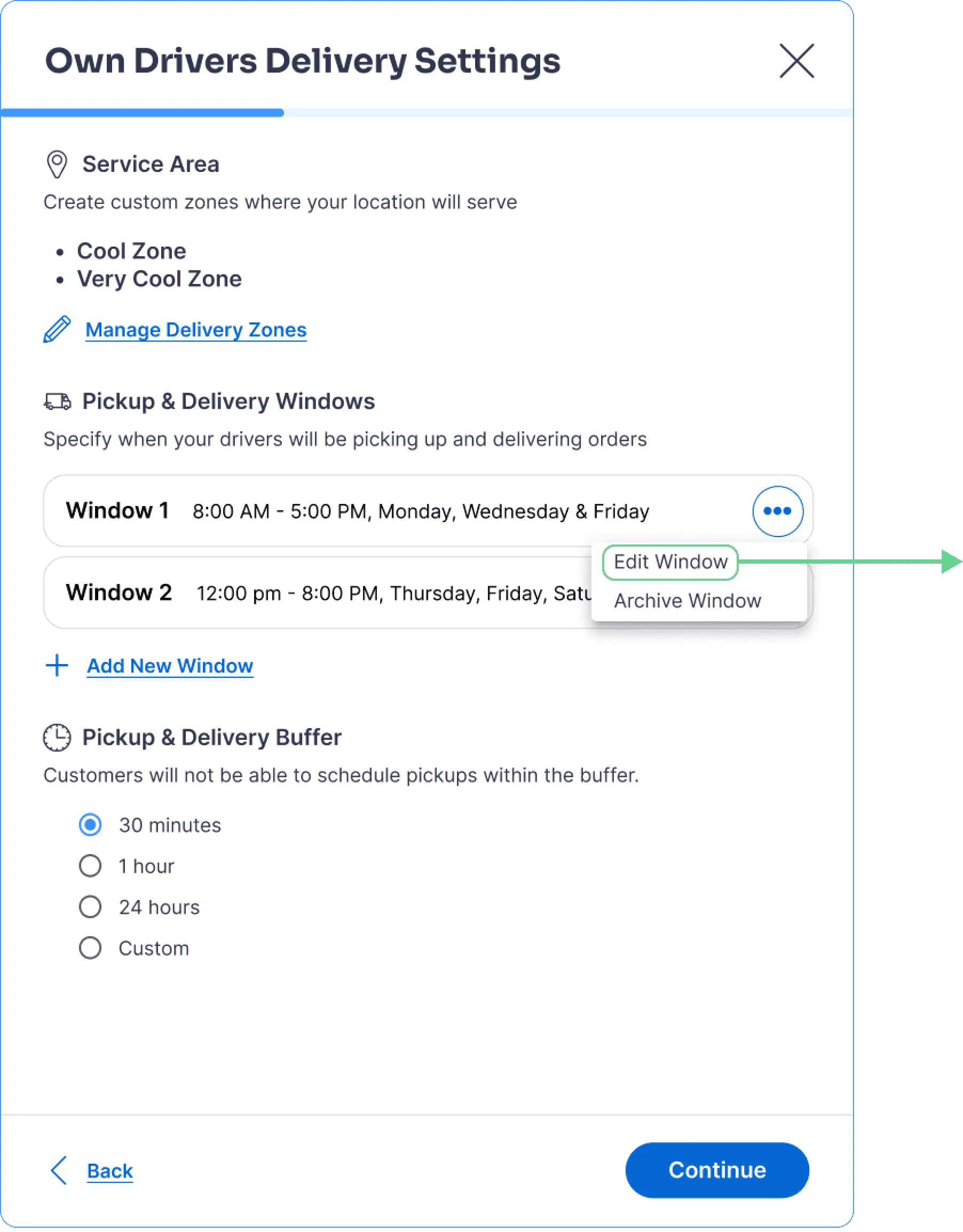
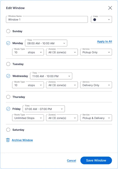
- Wrapped dropdowns save space and improve scanability
- Added functionality: archiving windows
Why this Works:
Designed for How Operators Think: Operators need to see more than just their window names; they need each window’s days, times, and service types. Making this information visible upfront reduces guesswork and speeds up decision-making.
Increases Operator Independence: By introducing archiving directly into the workflow, operators no longer need to rely on Cents customer support or engineering.
2 - REDUCING OPERATOR DROPOFF
Reimagining the first step of the onboarding flow
To combat the biggest drop-off point for operators, I used helper text to prepare and inform operators of the process.
Existing Flow: Users Dropped into Geofencing Without Context
Problem: Operators were being dropped directly into a complex geofencing task without context, causing high abandonment during onboarding.
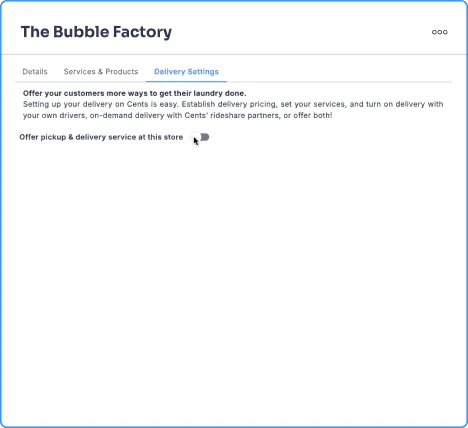
Step 1
Enable Feature
Operator turns on Pickup & Delivery settings.
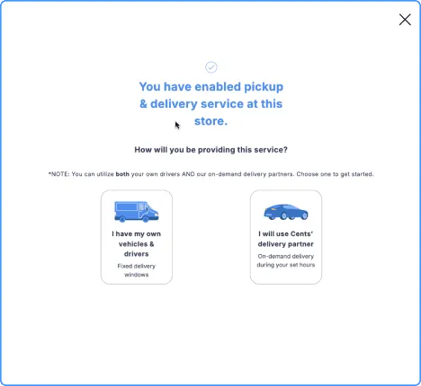
Step 2
Select Method
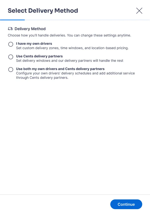
Operator selects “I have my own vehicles & drivers”.
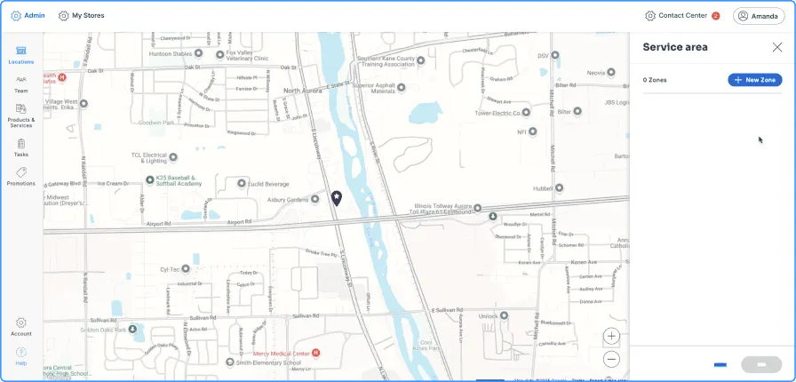
Step 3
Geofencing Wizard
Geofencing wizard opens without any prompting or instructions for the operator.
What Research Revealed:
During usability testing and funnel analysis, I noticed that operators most often dropped off during the geofencing wizard—typically after already spending 20+ minutes trying to set up their zones.
Setting up delivery zones with geofencing is not an intuitive first step because it requires a lot of thinking and attention for operators. As a result, it is very time-consuming. I wondered: could the geofencing wizard be moved later in the flow?
My Solution:
I originally explored moving delivery zone setup later in the flow to reduce friction, but that wasn’t possible.
Key Constraint: Delivery windows and pricing tiers require delivery zones, making geofencing a mandatory prerequisite.
Existing Flow:
- Start: Select Delivery Method
- Geofencing Wizard
- Pickup & Delivery Windows*
- Pricing Options*
*Requires geofencing as a prerequisite
New Flow: Adding Context Before a Required Task
Rather than removing or delaying geofencing, I focused on reducing cognitive load at the moment users encounter it by adding contextual guidance and previewing downstream value.
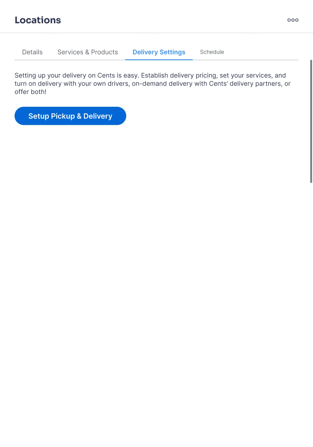
Step 1
Enable Feature
Operator turns on Pickup & Delivery settings, a primary button instead of a toggle.
Step 2
Select Method
Operator selects “I have my own drivers” with helper text previewing the steps.
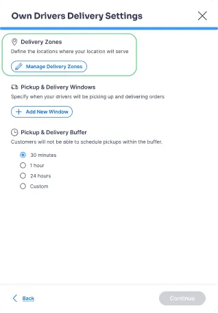
Step 3
Enter Geofencing
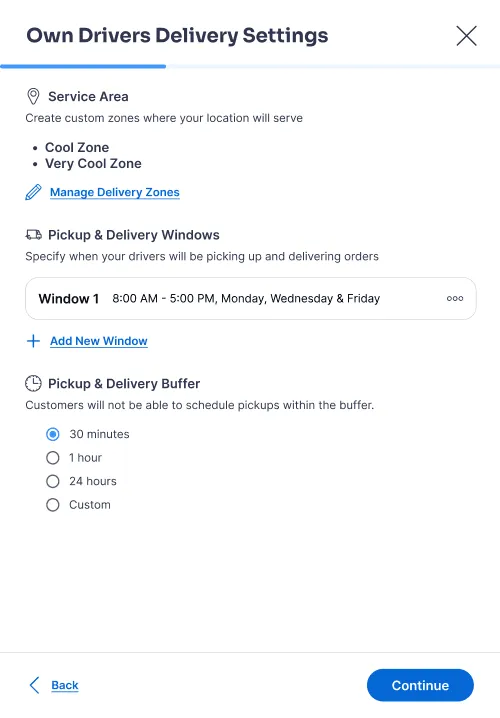
On the new panel, clicking “Manage Delivery Zones” opens the geofencing wizard.
Why this Works:
Reduces Surprise: Even though the new design adds a click for operators, it introduces context and expectation-setting before a cognitively-heavy task, reducing surprise and early drop-off with the geofencing wizard.
Increases Motivation: Previewing downstream settings (delivery windows and buffers) helps operators understand why delivery zones are required, increasing motivation to complete setup.
INCORPORATING FEEDBACK
Re-Introducing Break Points
I reviewed the redesigned flow with the design team and later presented it to the product team near the end of my summer internship.
Stakeholder Concern: Long Flow with No Pause Points
While feedback on the redesign was largely positive, a key concern emerged: operators may not have time to complete the entire pickup and delivery setup in a single session.
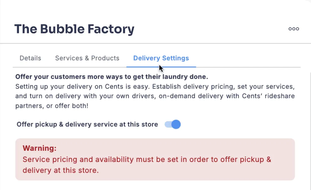
With the existing flow, incomplete setup resulted in a vague error banner that did not clearly explain what was missing or how to resolve it.
Problem: Operators need a way to pause mid-setup and confidently resume where they left off, without losing progress or context.
My Solution:
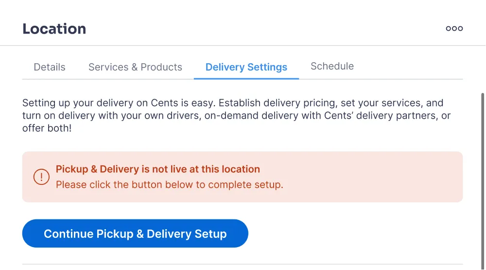
I redesigned the unfinished-state experience to support pause-and-resume behavior instead of treating incomplete setup as an error.
- Introduced Save & Exit breakpoints after major decisions (e.g., delivery method selection), allowing operators to safely leave the flow without losing progress.
- Reframed the error banner into a clear status message that explains why pickup & delivery is not live and what steps remain.
- Added a primary call-to-action that takes operators directly back to the next required step, eliminating guesswork and re-navigation.
This simple update maximized flexibility and better informed operators for an experience that better fits operators’ real-world time constraints.
Outcomes
My final redesign maximized clarity, flexibility, and operator independence across a critical pickup and delivery setup workflow.
- Validated through usability testing: I tested with 3 users with 100% task completion using the Figma prototype.
- Moving towards implementation: I am partnering with a developer for phased handoff, beginning with the most critical need: redesigned pickup and delivery windows.
- Measuring Success: Planned next steps include tracking operator completion rates and screens with highest drop-off rates to gauge success metrics.
Lessons Learned
01
Design Systems Speed Up Quality and Iteration
Leveraging existing components and patterns allowed me to focus more on solving user problems rather than reinventing UI.
02
Going Beyond the "Safe" Solution
Regular feedback from my mentor pushed me to move beyond safe, expected patterns and explore more intuitive solutions. Balancing design system consistency with screen-specific context is key.
03
Early System Understanding Prevents Costly Rework
Missing early context around the geofencing prerequisites led to rework later in the process, reinforcing the value of upfront research and stakeholder alignment, especially with a complex, multi-step system.